99.9% of the time, I choose to not judge a book by its cover. No matter what is on the outside, it’s what’s inside that counts, and that applies to video games too. However, there are the rare moments, usually at the end of the year, when I want to judge a game all day long for its terrible box art. Yes, it’s time to reflect on the worst box art 2016 had to offer.
Legendarily Bad Box Art
Now, it’s a very rare game that can match the worst box art of all time like the above examples. The fact is, most major publishers know how to put out average box art that’s not smack-you-in-the-face ugly. But I dug deep into the releases of this year to find the most terrible examples of box art from the calendar year. Some of these covers are from games you’ve never heard of, others from major releases. Some are lazy, others are downright amateur. But all are united in being the worst box art of 2016.
Mario Party: Star Rush ‘s real box art is perfectly cromulent, but it wasn’t looking so great when it was first revealed. Perhaps a Nintendo artist missed their deadline because the cover was merely old Mario clipart over a white background. The temporary box art appeared even worse when the above Twitter user discovered the art had previously been used on cans of Spaghetti-O’s.
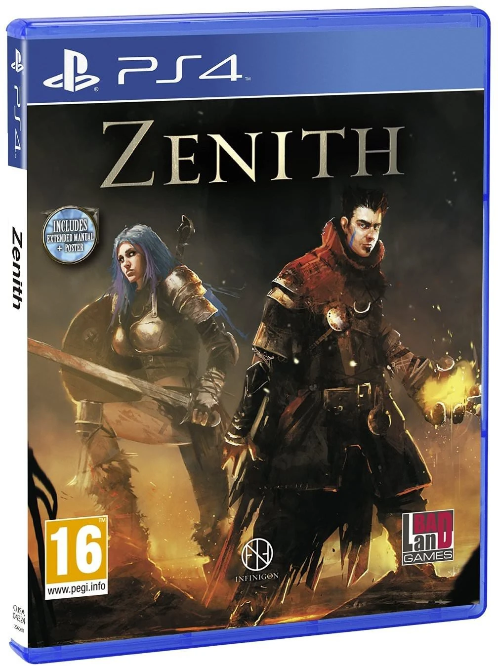
Zenith
At first I wasn’t going to include the cover of Zenith because this unpopular RPG was meant to be a comedy. “Is this an intentionally bad cover,” I thought, “perhaps one with where the character’s hands are supposed to be misshapen and have artifacted outlines?” But then I saw that Zenith failed at all its attempted in-game humor, so I figure that if this junky cover was purposefully bad, then it failed at that too.
Tumblestone
Tumblestone is a well-reviewed action-puzzler, so I don’t want to be too mean. And yet, I just can’t hold back my revulsion at its deformed characters in front of a nondescript gradient background. Seeing a bunch of overused character tropes like Orc and Cleopatra squished into Mr. Potatohead shapes is just painful to look at for when Tumblestone arrived on the Wii U. And as one of very few Wii U retail releases this year, its disappointing design stood out all the more.
Tokyo Twilight Ghost Hunters
Who needs characters or a setting when you can have logos?! And why to stop at just a single logo when your cover can be buried in text!?! Tokyo Twilight Ghost Hunters is a cult favorite visual novel that made the jump to the PS4 in 2016. When the publisher switched systems, they also switched the box art, removing any character or concept of what the game is, instead inundating confused consumers with bumper stickers.
Adam’s Venture Origins
It’s very likely this article is your first exposure to this Adam’s Venture Origins. This unknown remake of a Dutch-developed adventure title decided to dump all its recognizable characters when it got rereleased on PS4. Who needs faces or action when you can showcase an empty, musty tomb? Seriously, this tomb is so boring that Lara Croft wouldn’t waste five minutes raiding it.
R.B.I Baseball 2016
In real life, Red Sox player Mookie Betts is full of life and energy. But when he’s the cover star for the baseball game developed by Major League Baseball, Mookie has dead eyes and a distorted body that no motion blur could hide. Maybe MLB realized this was a lame cover, because R.B.I. Baseball 2016′s Canadian box art instead settles for a photo of Blue Jays’ Marcus Stroman.
Mount & Blade: Warband
That horse seems much more excited for this role-playing adventure than its rider. The armored woman looks like she’d rather be anywhere else than this battlefield. Perhaps she’s just tired and sickened by whatever it is that’s causing that green mark on her face? No matter what’s causing this flat picture, the logo is what needs work the most. The words “Mount & Blade: Warband” look like they came straight from the free Fantasy Font pack that found in Photoshop.
Ghostbusters
So, let’s say you’re making a game that’s tied into the launch of a big summer movie. But your tie-in game didn’t have the budget to use the actors from said would-be blockbuster? There’s an easy fix — just take your four Ghostbusters and put them in silhouette! Yup, all you need is a logo, a nondescript city street, and dark outlines of people to guarantee a million-seller! (Note: Ghostbusters did not sell a million copies.)
Destiny: The Collection
Though by no means as bad as Batman: Arkham City‘s greatest hits cover, Destiny: The Collection is a lot of information at once. This rerelease puts all of Destiny‘s many expansions into one cluttered cover with five different old box arts and logos stacked on top of each other. Bungie’s original art is all great, but when piled on top of each other, it’s more than your eyes can take in. Maybe save some of this info for the back of the box?
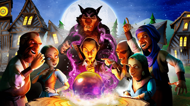
Werewolves Within
Have you ever played one of those real life party games where one player is secretly a werewolf, and you have to guess who it is? Ubisoft’s Werewolves Within brings that to PlayStation VR, and it’s buried under sub-Dreamworks level art design. Those are some very unmemorable medieval townsfolk, and right in the center is the werewolf. Though if you thought the hairy enemy was the world’s cheapest looking Muppet, I wouldn’t blame you.
The Last Guardian
Lastly, we arrive at the entry I wanted to write the least. Listen, I love The Last Guardian. Read our Last Guardian review to see how much we enjoyed this journey of boy and beast. But one thing that wasn’t worth the wait was the box art. The middle image is inoffensive, but it’s centered with black outlines like some sort of lame motivational meme. And just flatly dropping the logo on top of a black background? C’mon, The Last Guardian, you’ve had a whole decade to work on this box art. You could’ve done so much more. At least the cover is reversible.
Henry Gilbert is Senior Games Editor at Fandom. He's worked in the gaming press since 2008, writing for sites as diverse as GamesRadar, IGN, and Paste Magazine. He's also been known to record a podcast or two with Laser Time. Follow him on Twitter @henereyg.